As Creative Lead
Refreshing Zinier
As the art director and leader of a talented team of designers, video producers and developers, I oversaw the production of all experiential, digital and print elements for Zinier’s new brand identity, which was used by all internal teams and marketing campaigns.
We used the new brand guideline as a foundation for our creative work. The challenge was to make it better, and to ensure a coherent look & feel across different formats, media and content.

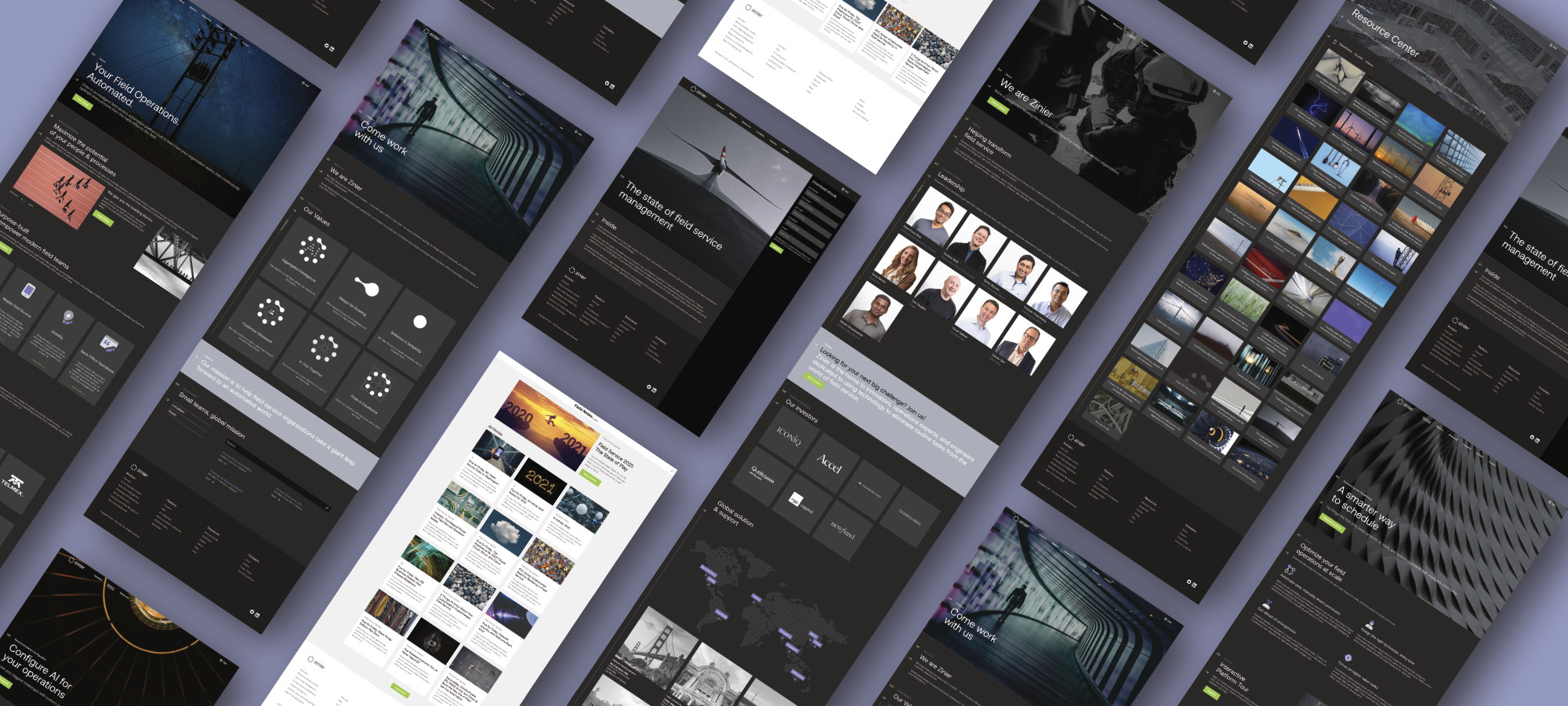
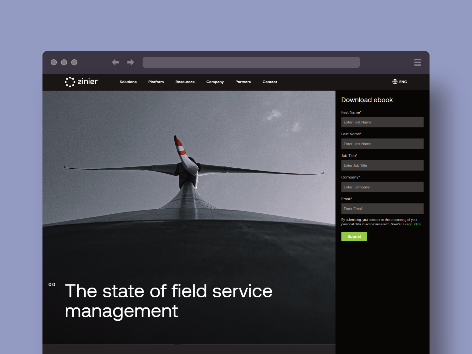
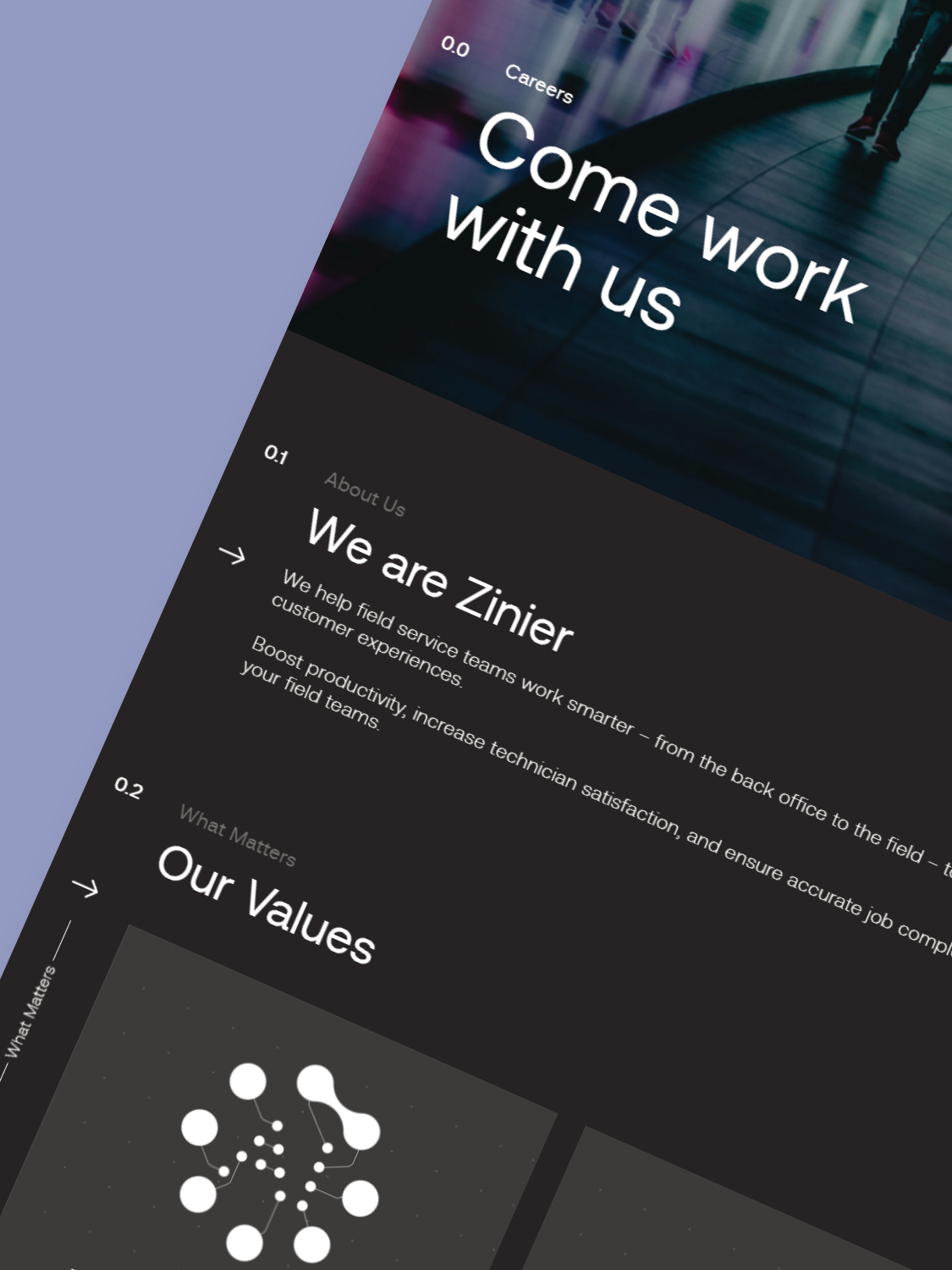
Zinier.com
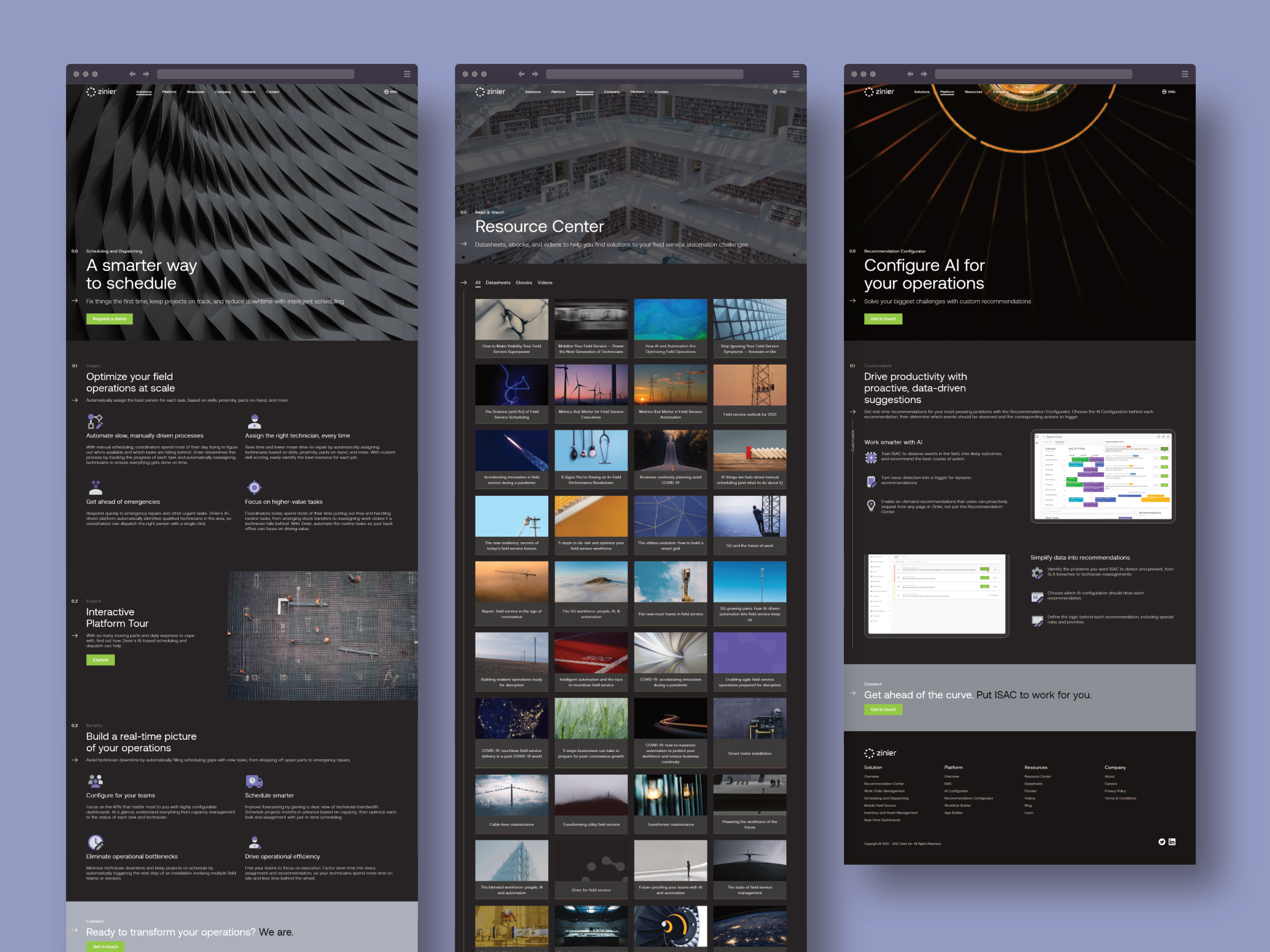
Zinier’s product serves a very specialized audience, so we focused on making detailed information easy to find and understand for IT and technology leaders. To achieve this, we balanced text-heavy pages with large, compelling images that convey emotion and reinforce the brand’s message. We used ample negative space in both the photos and layout to improve readability and reduce cognitive load, allowing users to scan content more comfortably. To guide users visually through complex information, we incorporated indicator widgets like numbers, arrows, titles, and lines, which help create a clear visual hierarchy and intuitive navigation. This combination of thoughtful imagery, clean layout, and visual cues ensures the site is both engaging and user-friendly, enabling visitors to quickly locate what they need without feeling overwhelmed.
Field Notes
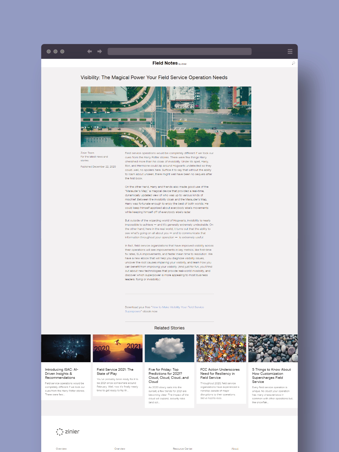
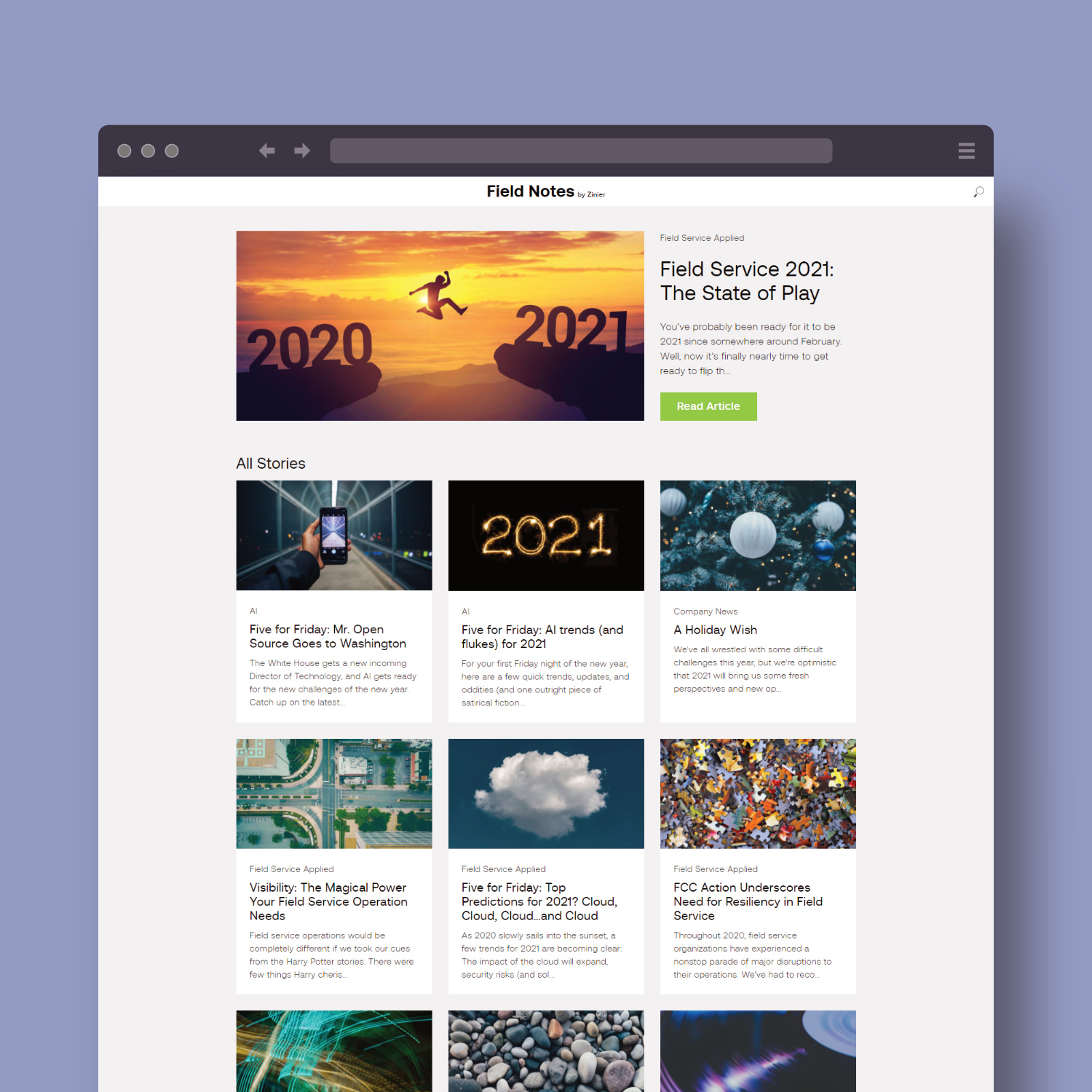
The blog uses a light mode interface to improve readability on pages with long texts, as lighter backgrounds enhance concentration. Studies show that white space around text can increase focus by up to 20%, making the content easier to absorb. Additionally, we aimed to establish a distinct and memorable brand identity for the blog, a goal that this design successfully achieves.
Badges
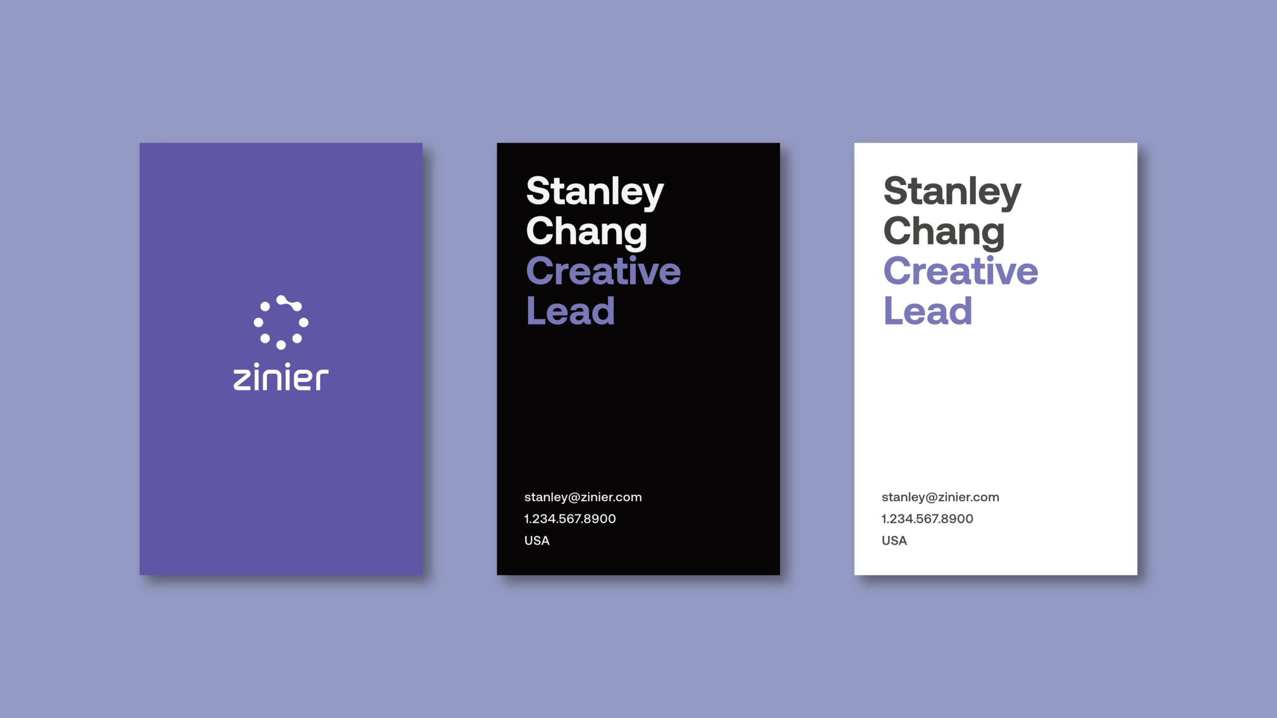
Biz Cards
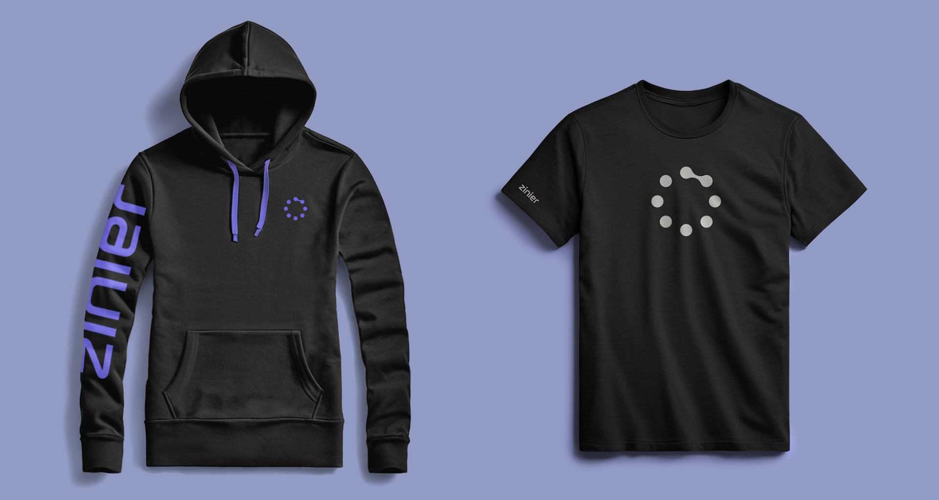
apparel
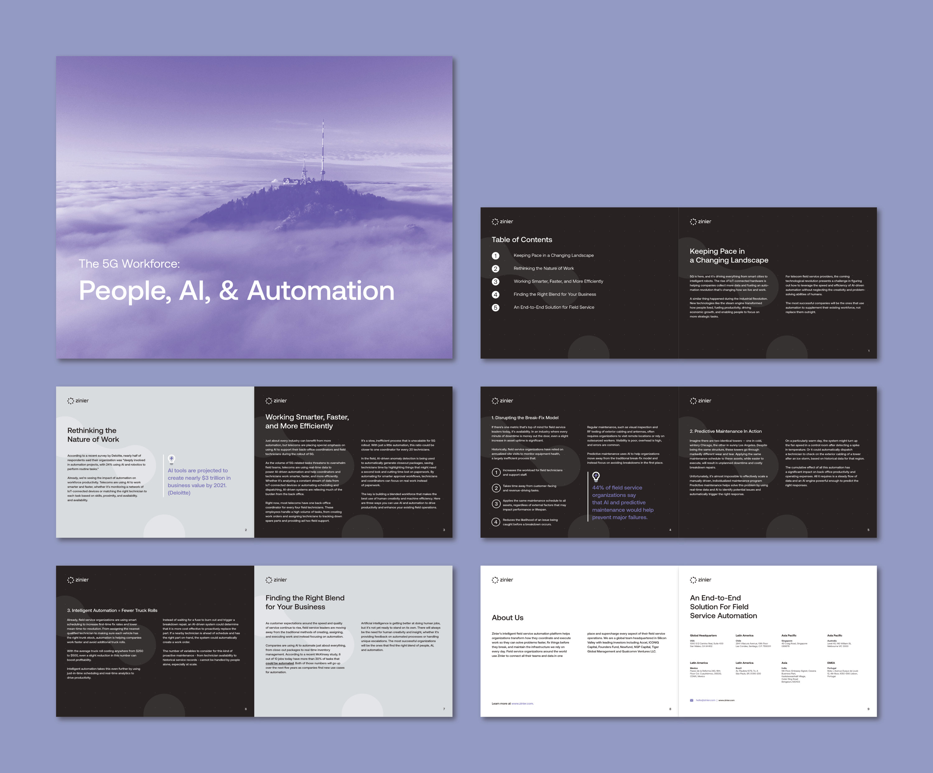
eBooks
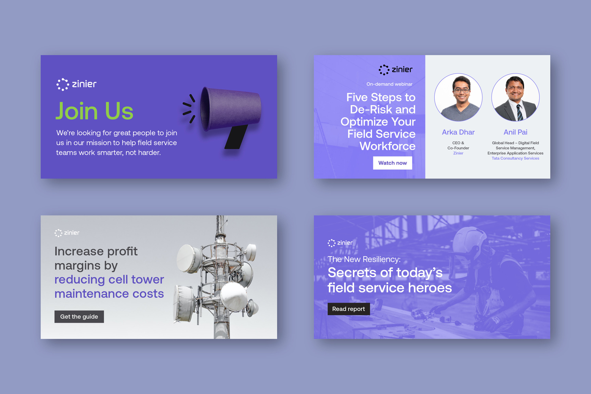
ads
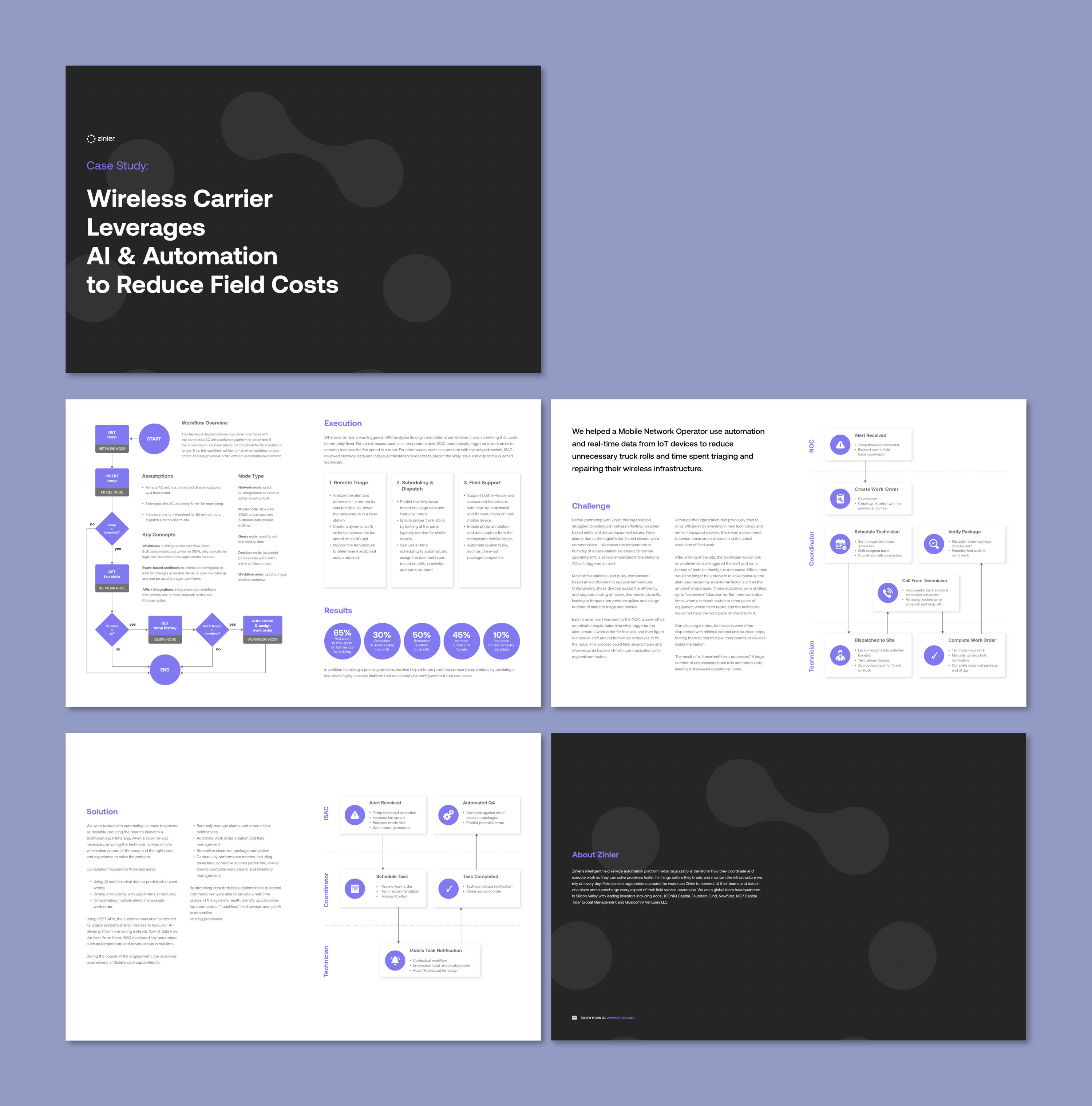
Case Studies