As Designer
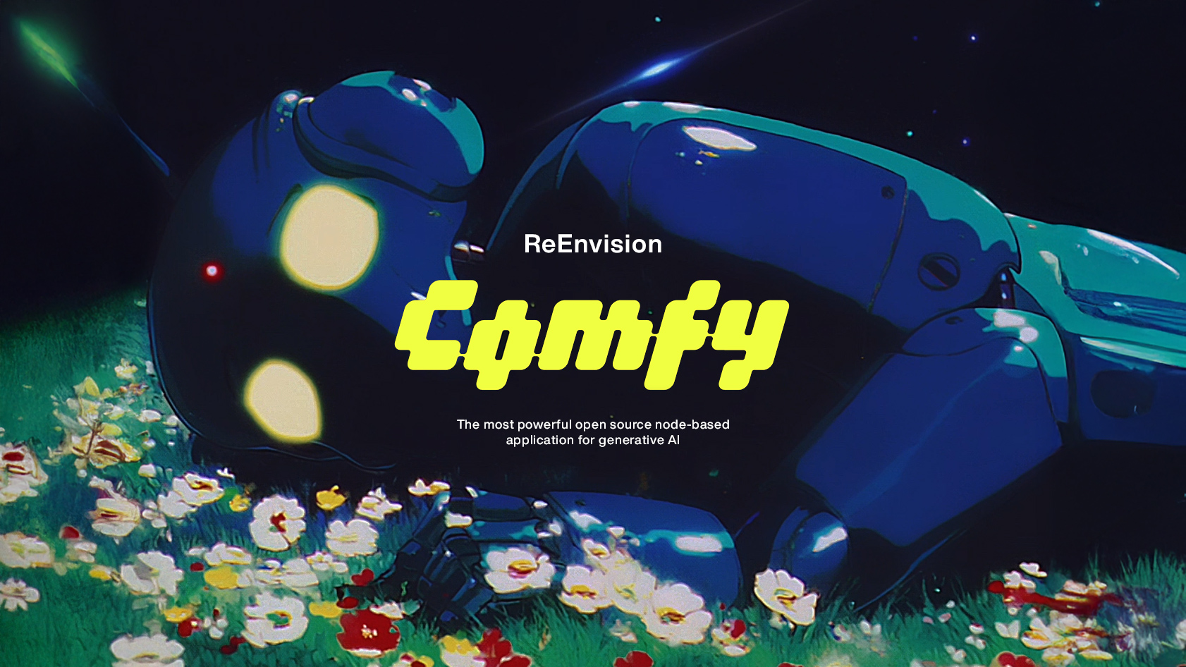
ReEnvision ComfyUI
Developed by a team of mission-focused, brilliant individuals, Comfy, rebranded ComfyUI, is a powerful open-source node-based interface for AI image, audio and video generation, that lets users create workflows by connecting visual nodes instead of using simple text prompts. This modular approach provides advanced control over the generation process, making it popular with power users who want fine-tuned control over their AI art creation, though it’s more complex than traditional interfaces, with a steeper learning curve.
As a designer who wants both the power and aesthetics of their tools, it’s hard for me to overlook some of its UI design decisions that might detract from the user experience.
So I took a stab at redesigning it; blending what I love and what I’d like to see improved. This is based on late 2025 front-end.
Current Visual & Experiential Challenges
As of August ’25, Comfy has not yet promote a strong, unified brand identity across its interface, documentation, and user experience. The UI is modular and highly customizable, which allows for great workflow flexibility but also leads to inconsistent visuals and styles between different workflows, user extensions, and third-party modules. As a result, users might see varying node appearances, icons, and color schemes depending on what extensions or templates are installed. This lack of brand consistency can make the platform feel fragmented and less cohesive for newcomers, though it enables advanced users to tailor the environment to their preferences
Redesign
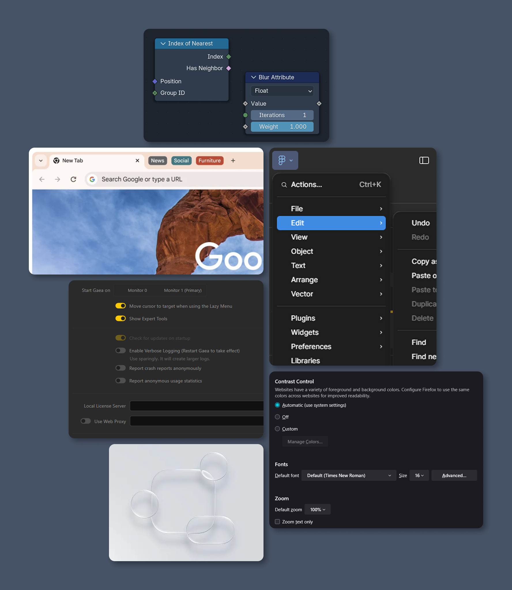
My plan is to inject ComfyUI’s newly rebranded logo and color palette into the interface, while minimizing and reorganizing elements to suit my personal workflow. This redesign is a personal experiment, undertaken before any user research, and draws inspiration from my experiences with various tools. I aim to incorporate my favorite aspects from Chrome’s tab system, Gaea and Firefox’s setting format, Blender’s geometry nodes system, Apple’s recent liquid glass aesthetic, and Figma’s , combining them into a cohesive and visually refreshed ComfyUI experience.
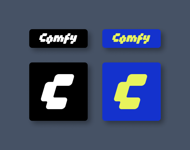
The New Icon System
I’m starting with a new icon system for the redesign, focusing on a minimal set of icons because we don’t actually need that many. Keeping the icons simple and consistent will help create a cleaner, more intuitive interface while maintaining visual unity across the platform.
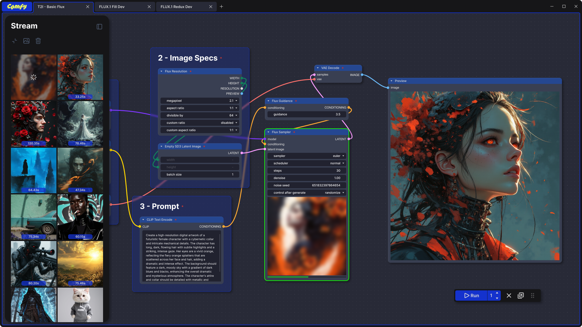
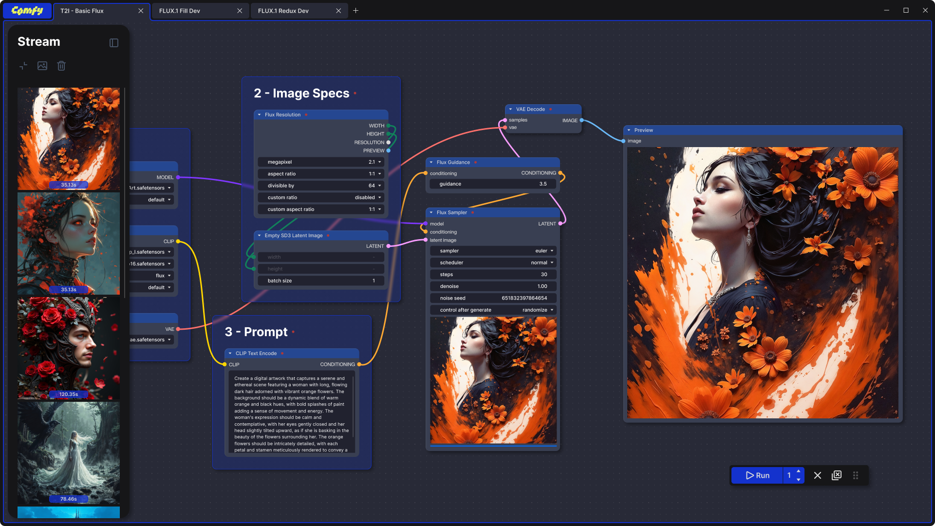
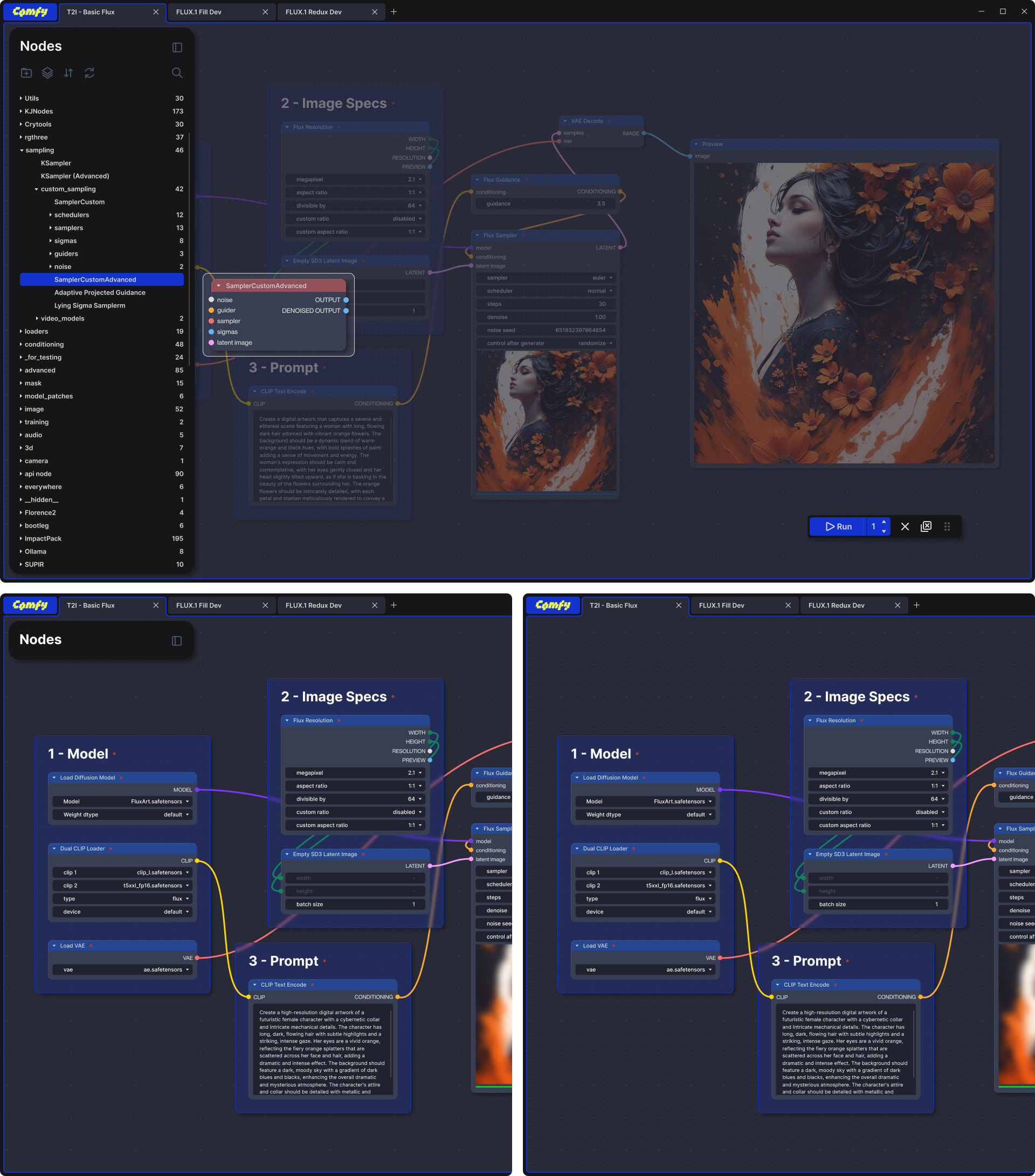
The Tab System & Canvas
It’s always best to use elements that are already good, functional, and familiar to most users. The tab system, widely used in many browsers, makes navigating between workflows intuitive.
For the Canvas, I replaced the original line grid with dot grid , which provides more subtle visual guidance while maintaining precision when needed. This balance helps keep the interface clean yet functional.
The Comfy logotype is served as the main switch.
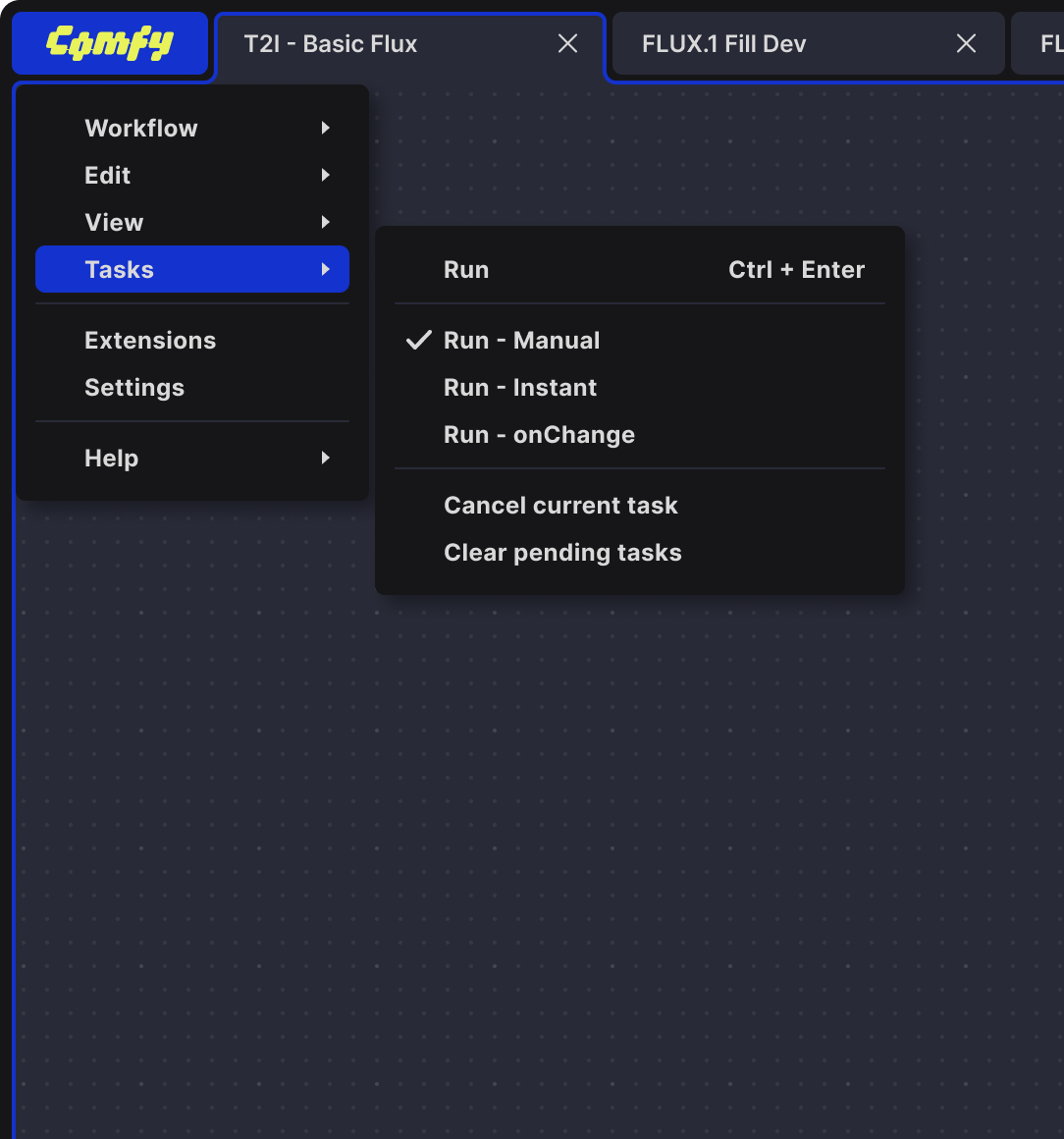
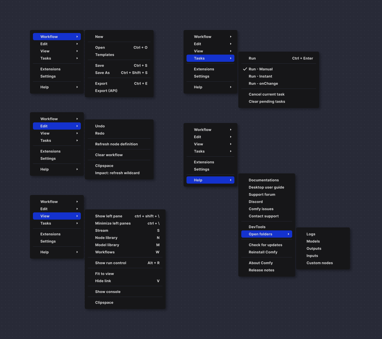
The Menu System
This area is ideal for showcasing Comfy’s primary colors. I chose Comfy Blue as the highlight to increase menu contrast, making it easier on the eyes and reducing visual strain.
I consolidated and hid several functionalities into the main menu, making it the single place to access all features. This simplifies the interface, especially as workflows grow more complex. This approach also aligns with my workflow, which relies heavily on keyboard shortcuts for efficiency.
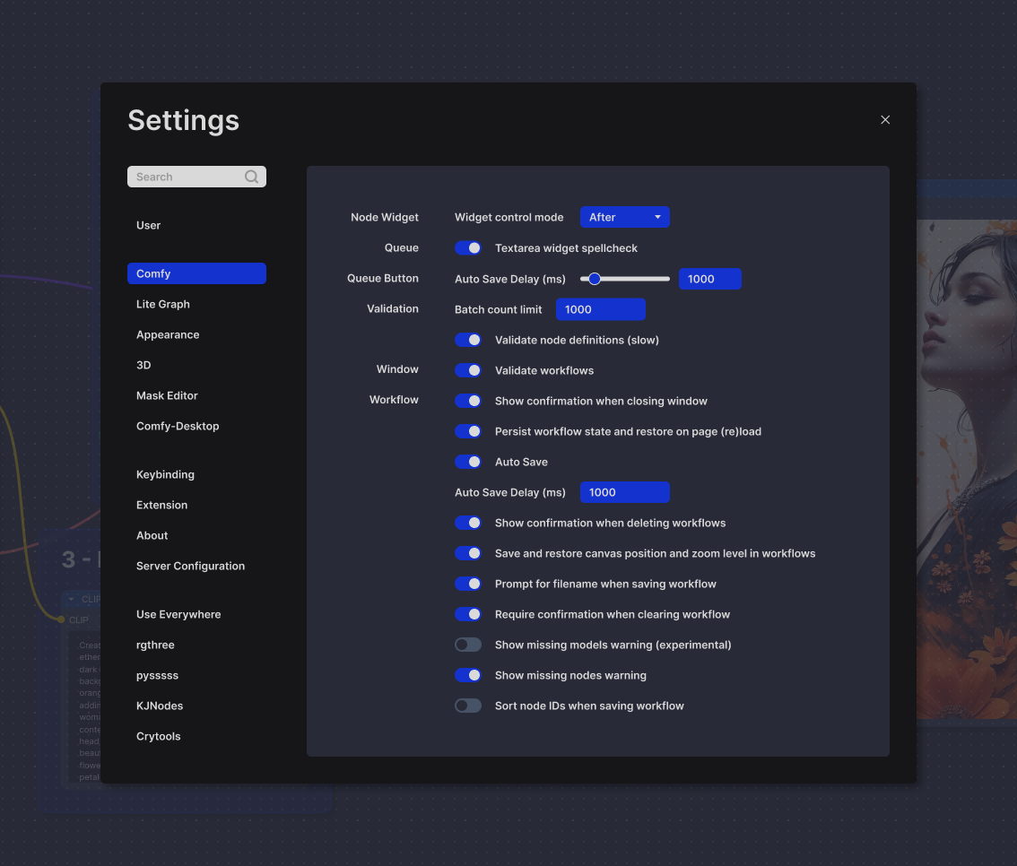
Settings
Similar to the menu system, the use of high contrast and bright highlights is designed to draw the user’s eye directly to interactive elements on the page. This helps users quickly and easily identify actionable areas, improving overall usability and navigation.
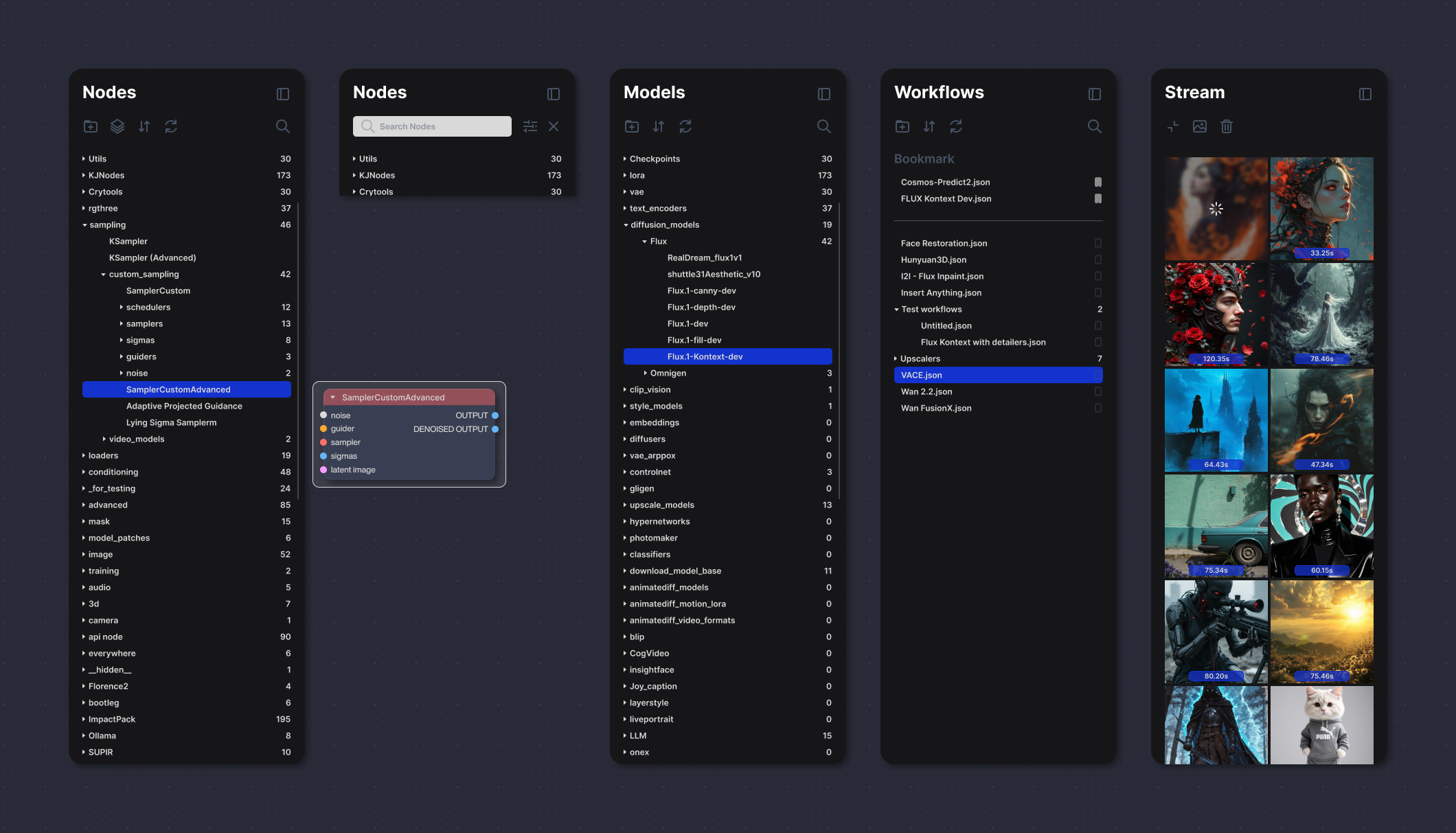
Left Panel
The left panel is collapsible and can be hidden via the menu or keyboard shortcuts. It serves four main purposes:
- Nodes: displays available custom nodes with descriptions; selected nodes can be dragged onto the canvas.
- Models: lists models available on the system.
- Workflows: shows workflows saved on the system.
- Stream: presents generated assets.
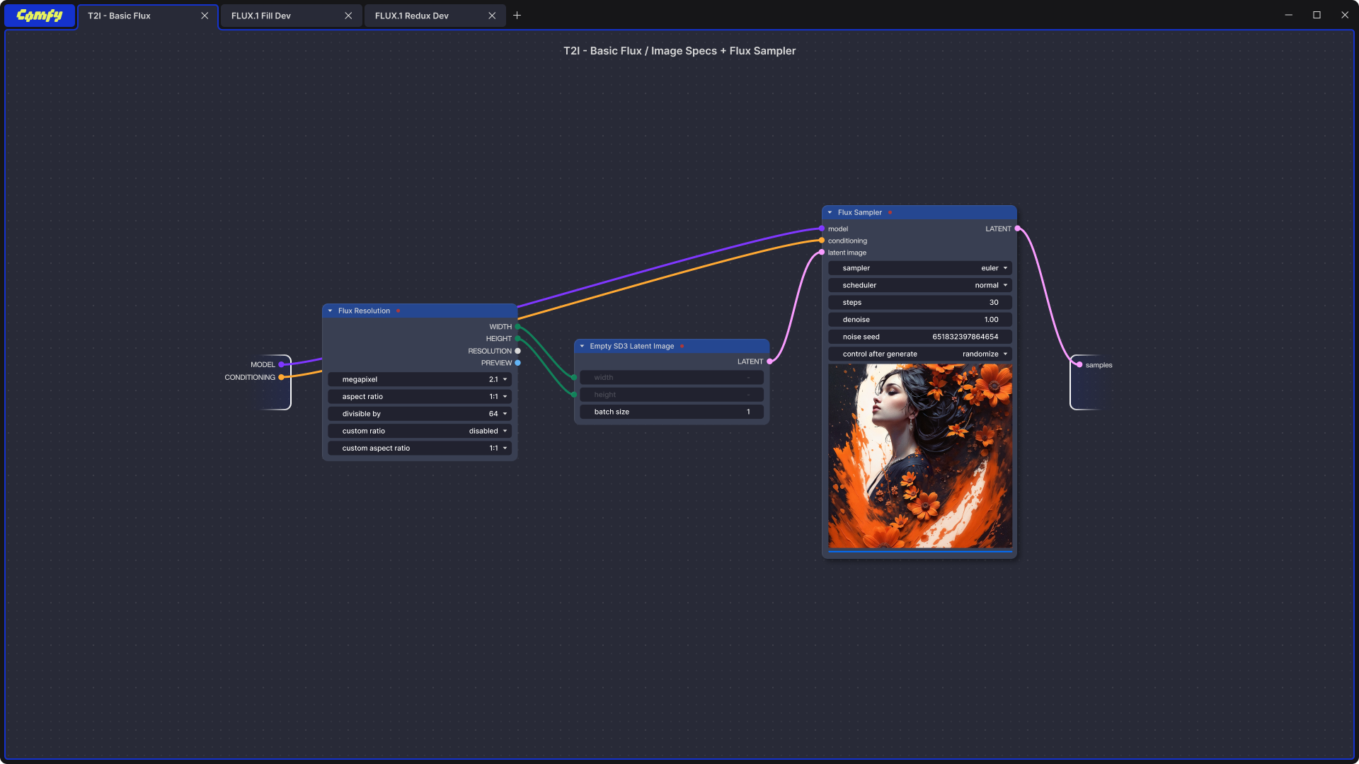
The Node System
The node system draws visual inspiration from Blender’s geometric node design, showcasing a clean and modular look. It emphasizes ample negative space within node boxes and slightly more spacious drop-downs and text areas, creating a comfortable and uncluttered user experience. Node grouping incorporates a liquid glass blur effect, adding visual appeal and making the interface more pleasant and enjoyable to work with. This use of spacing, along with the subtle visual candy from blurred node groups, keeps the interface legible and engaging—even as workflows become more complex—making it easier and more enjoyable to build with nodes.
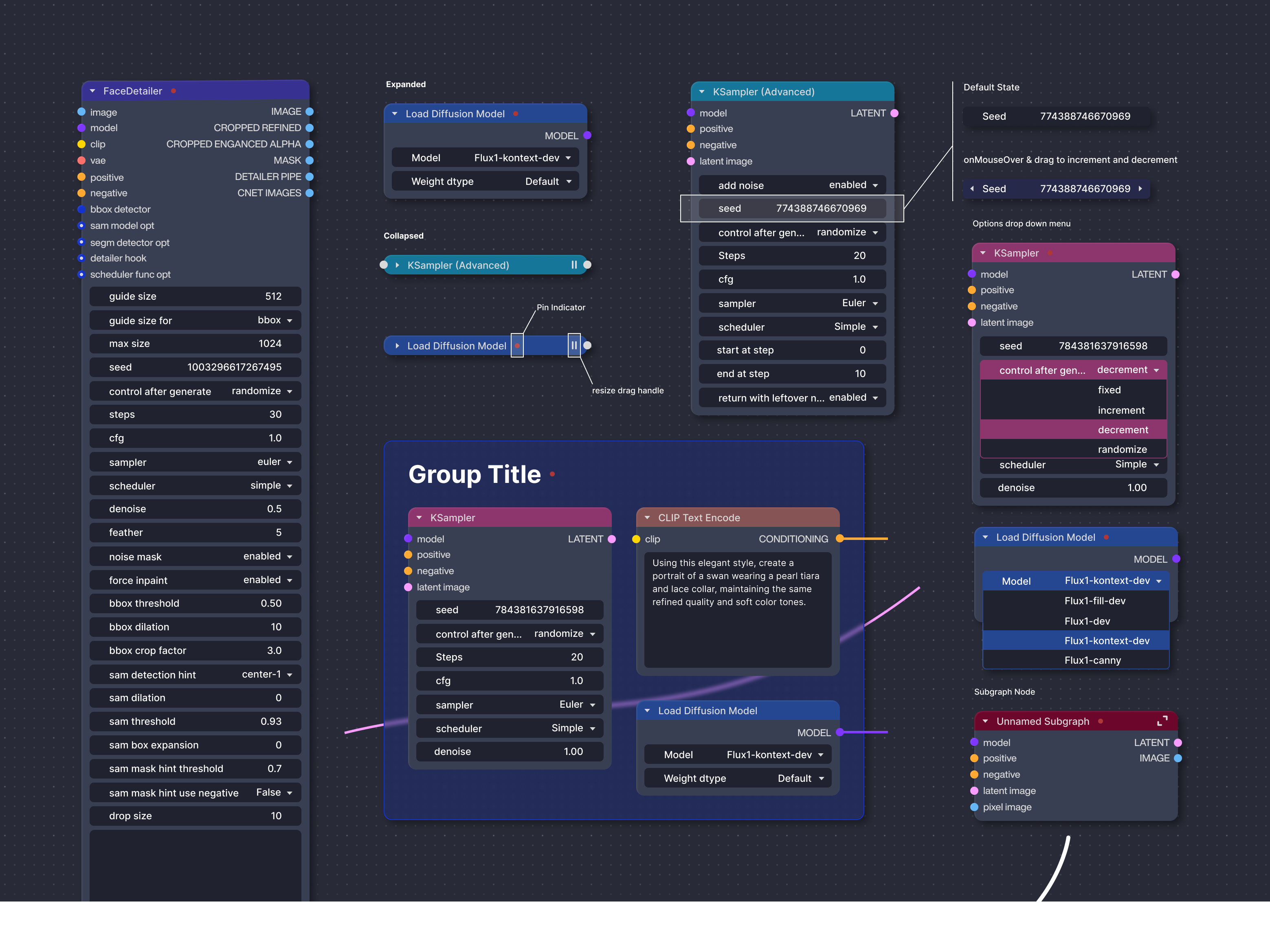
Expanding The Subgraph
ComfyUI’s subgraph feature lets users group complex workflows into single reusable nodes, simplifying and organizing projects while keeping full editability. It reduces clutter and boosts efficiency by turning detailed node setups into easy-to-manage modules.
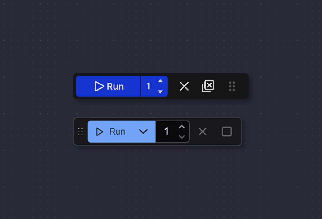
Run Widget
I made a slight adjustment to the order of the buttons and the drag handle to better suit my personal preference. Since I don’t change the run setting very often, I also relocated the drop-down to the main menu. This streamlines the widget and makes it simpler to use.
Final Thought
Comfy remains the leading open-source generative AI application for designers and artists seeking advanced features and extensive control over their AI creations. It is continuously updated daily by a dedicated team and supported by an active open-source community to keep pace with the rapid evolution of AI technology. This project is a passion initiative shared openly with the community, aiming to be a meaningful and lasting contribution to creative AI tools.